
Why Wellness Websites Fail (And What to Do Instead)

If you are a wellness practitioner (think therapist, coach, yoga, energy healer, nutritionist) you probably already realize how important your website is, and that maybe you need something different than any other industry. In this post, we are going to cover three reasons your website is not working for you, and what to do so that changes.
Let’s get right into it with the first point. And I’m sure you’ve heard it before, many times. But it really is that important.
Your website doesn’t help users feel safe
It is important to define safe here, as that could look and feel different to certain types of people. Leading with the idea that how your website makes people feel, is of the utmost importance, that includes your color palette (are there multiple loud colors clashing and competing with each other?), your fonts (do they complement each other?), and your images (are they cohesive? Do they actually represent your brand? Are they calming?). As you can see there are many combinations of things that contribute to the overall feeling of your pages. The amount of white space on your pages also makes a big impact to users. Do their brains and nervous systems get a moment to process what they just read, or are they immediately hit with even more information?
As an example, we took our gentle Petal template, and gave it a “loud” makeover. While it may seem extreme, the point is, that when you use clashing colors, such as this orange and yellow, with some loud fonts, you can easily see how someone may feel…uncomfortable. Or anxious. Your current colors may not be quite as loud as these, but take an honest look at what you have and check in on your nervous system. Better yet, ask a trusted friend how they feel when they look at it.
We placed the actual Petal template next to it for reference. Which one makes you feel calmer?
What to do instead: Simplify. Remove anything that isn’t essential. The more breathing room people have, the better. The less friction and decision fatigue, the better. Do a website audit for your branding specifically. Is your color palette competing with itself? Look at your images and do the same thing. Elements in the same category should always feel cohesive, not like they are from completely separate websites.
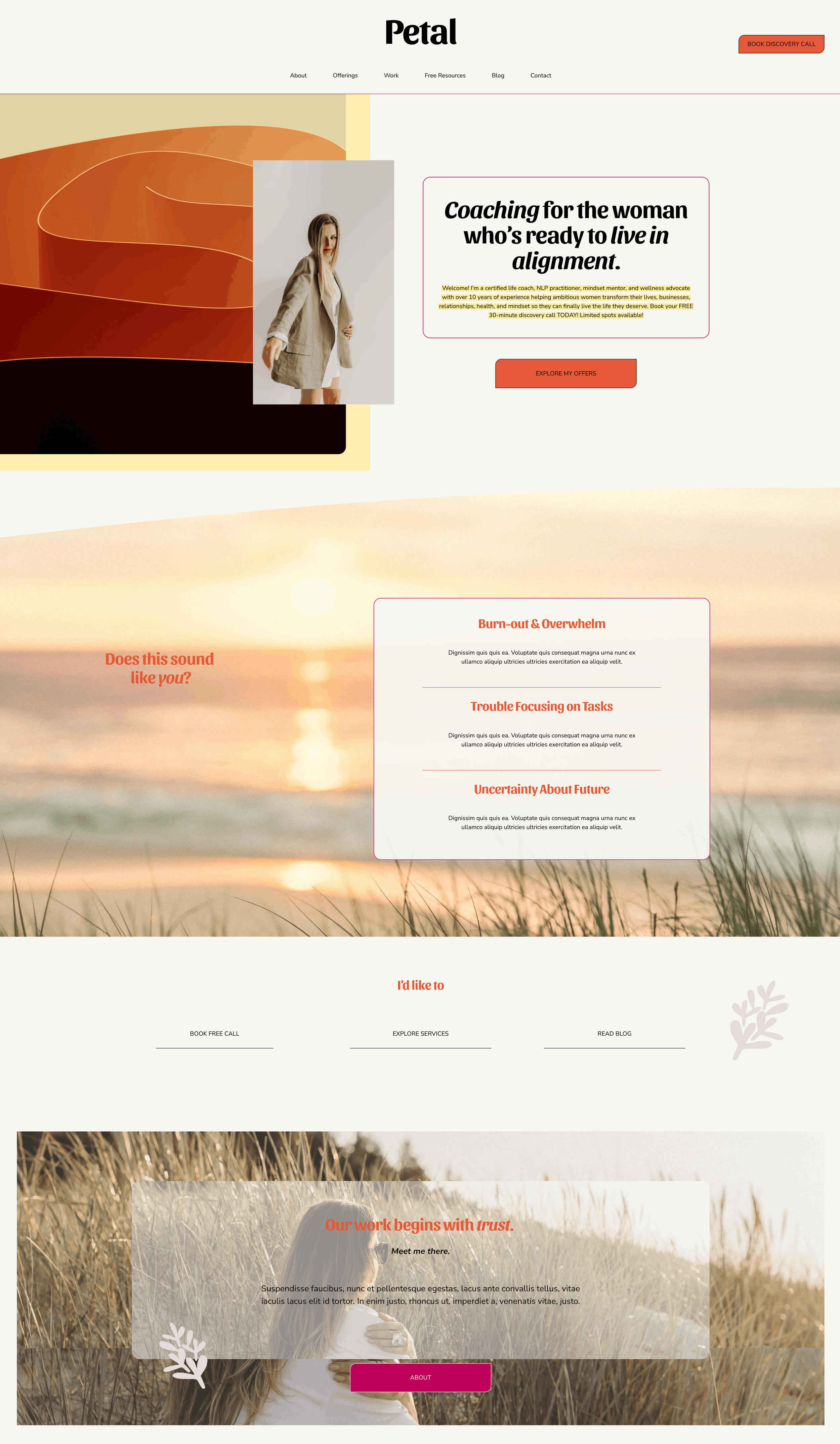
Loud clashing colors and bold header text makes this website feel chaotic and uncomfortable for those who are seeking wellness services.
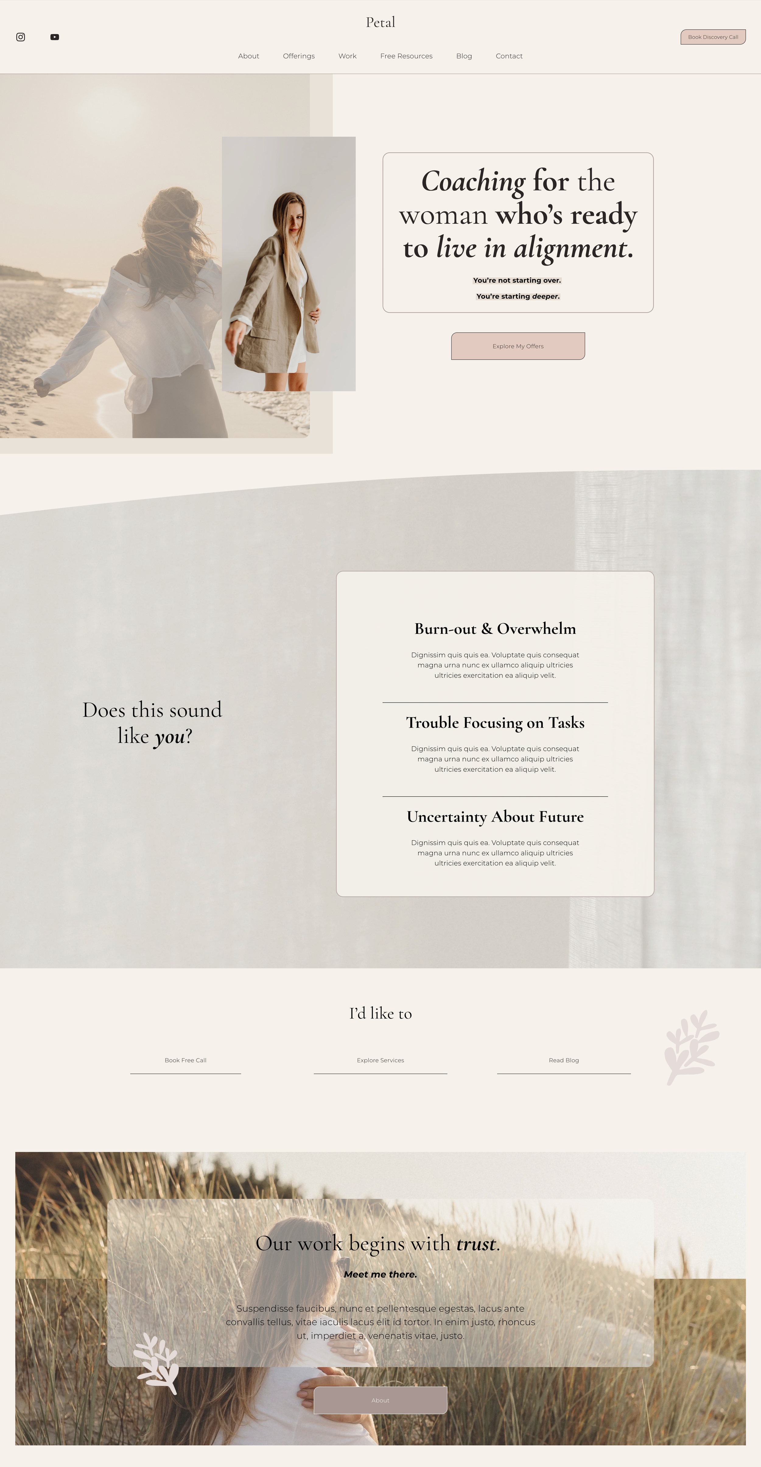
The Petal template with its intended calm color palette and breathing room.
It's not specific enough and looks and sounds like everyone else
Would visitors to your website know that you have a specific niche? Or that your approach is in fact different than the other practitioners in your field? Are you setting yourself apart, or just blending in and hoping for the best? This is where having effective copy on your website is super important.
Your website should have a point of view. A specific aesthetic that reflects not just your niche but your personality, your approach, and the specific transformation you offer. Someone should be able to land on your site and feel immediately that not only is this is different, but that there's a distinct human behind it with a real perspective.
What to do instead: Get really clear on what you do and who you serve. And for practitioners that do serve a more general group, you can still re-phrase things to stand out. If you are a therapist and serve anyone with anxiety, is there at least a unique way you approach it? If you are a yoga teacher that generally works with women, can you phrase it differently, such as “yoga for the woman who does everything for everyone else”? Asking yourself what sets you apart might help you figure this part out
The copy is about you instead of the visitor
This is a really common mistake that directly affects whether someone books with you or not. It’s easy to want to convince people to work with you based on your qualifications, but you don’t want to forget that your services and offerings are not about you, they are about your clients and audience. The truth is, when someone visits your website, they are thinking of themselves. Their fatigue, their illness, their frustration. Your audience wants to read the words on your website and see themselves in them. Not just see you going on and on about why you are so great. And to be clear, you definitely want to showcase who you are and have an About page to help people understand who they’d be working with and paying their precious money to, but make sure that isn’t all you talk about.
For example, if your copy reads, “I’m Amy and I help women who are tired and want more in life. I know what’s it’s like because I’ve been there after battling chronic illness for over a decade. I was lost and confused…..”. As much as there is in fact value in speaking to your own journey so someone knows you understand what they are going through (save this for the About section!), you can see where you may come off a bit…into yourself.
What to do instead: Read your homepage copy and count how many times you use the word "I" versus "you." If "I" is winning by a lot, rewrite with the visitor at the center. Start with what they're feeling, what they want, and how you help them get there.
All three of these mistakes come down to the same thing: a website that was built for the practitioner instead of the visitor. One that reflects what you wanted to say rather than what your client needs to feel.
The good news is that none of this requires a complete redesign or a $5,000 custom website. It requires intention. A clear aesthetic that feels safe and specific. Copy that speaks to your visitor first. A design that gives the nervous system room to breathe.
That's exactly what our Squarespace templates for wellness practitioners are built around. Websites that feel as good as the work you do.