
ALIGNED AESTHETIC: How to Choose the Right Website Template for Your Therapy Practice
Whether or not you already have a website, if you're a therapist looking to get your practice online, but you’re not in the place to spend thousands of dollars on hiring a professional web designer, choosing the right website template can still feel overwhelming. Here at House of Poppy Creative, we design Squarespace templates specifically for women in health and wellness professions. There are thousands of options out there and most of them weren't built with your specific needs in mind. A great therapy website isn't just about looking professional. It's about creating an online space that makes potential clients feel safe, seen, and ready to take the next step.
Here's what to look for when choosing a website template for your therapy practice. And remember, many of these can apply to other wellness professions, such as coaching, nutrition, yoga, energy healers, among many others.
1. It Should Build Trust Before Anything Else
Your potential clients are coming to you at some of the most vulnerable moments of their lives. Before they read your credentials or browse your services, their nervous system is already scanning your website for cues. Does this feel safe? Can I trust this person?
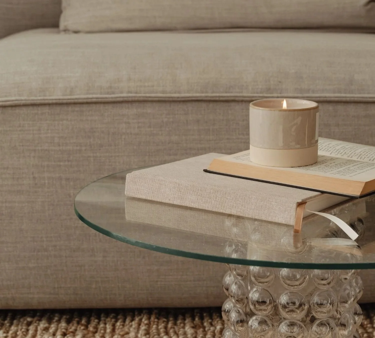
A therapy website template needs to create an immediate sense of calm and credibility. That means clean layouts with plenty of breathing room, a warm and grounded color palette, and typography that feels approachable rather than corporate. If someone lands on your site and feels even slightly more at ease, you've already done something most websites never accomplish.
Look for templates that prioritize simplicity and visual clarity over busyness and too much of everything. Every element on the page should serve a purpose. Anything that competes for attention takes away from the feeling of safety you're trying to create.
Our templates at House of Poppy Creative are designed specifically with this in mind. Every layout, color choice, and design decision is made to help your visitors feel held before they've even read a word.
2. It Should Speak to Your Audience, Not Just About You
One of the most common mistakes therapists make on their websites is writing entirely about themselves. Their training, their approach, their modalities. And while all of that matters, it's not what your potential client is thinking about when they land on your site.
They're thinking about themselves. Their anxiety, their relationship struggles, their exhaustion. Whether anyone actually understands what they're going through.
The right therapy website template will have a structure that naturally puts your visitor at the center. A hero section that speaks to their experience before introducing you. A layout that leads with empathy and then earns the right to talk about your credentials.
When someone lands on your website and thinks "this person gets it," you've already built more trust than any credential ever could.
3. Be Clear About Your Specialties (& don’t try to appeal to everyone)
Therapy is not one size fits all and your potential clients know that. Someone dealing with trauma is looking for a very different therapist than someone navigating a career transition or relationship issues. If your website is vague about what you actually specialize in, the people who need you most will keep scrolling.
Being specific about your specialties is not limiting, it is clarifying. It tells the right people that they are in exactly the right place and filters out the people who would not be a good fit anyway. A therapist who works with highly sensitive people, trauma survivors, or someone grieving major life events, will attract far more aligned clients by naming that clearly than by trying to appeal to everyone.
Your specialties should be visible and easy to find, ideally on your homepage and your services page. Don't make potential clients read between the lines or dig through your about page to figure out if you work with people like them.
Look for a template that has a clear dedicated section for specialties or areas of focus so you can communicate this simply and confidently right from the start.
4. Your Services and Fees Should Be Clear
A confused visitor doesn't book. If someone has to hunt around your website to figure out what you offer, who you work with, or how to get started, they'll leave before they find the answer.
On the fees front, clients want to know what to expect financially before they reach out. Having to email or call just to find out if someone is even within their budget is a barrier that many people won't push through, especially when they're already feeling vulnerable. Research has shown that a majority of people dislike a lack of transparency when it comes to pricing, so even a range, a starting point, or a clear note about whether you accept insurance or offer sliding scale options gives potential clients the information they need to feel confident taking the next step.
As you can see below with an example from our Dahlia template, we included a pricing line above the booking button. The services are clear, as are the fees that correspond to them.
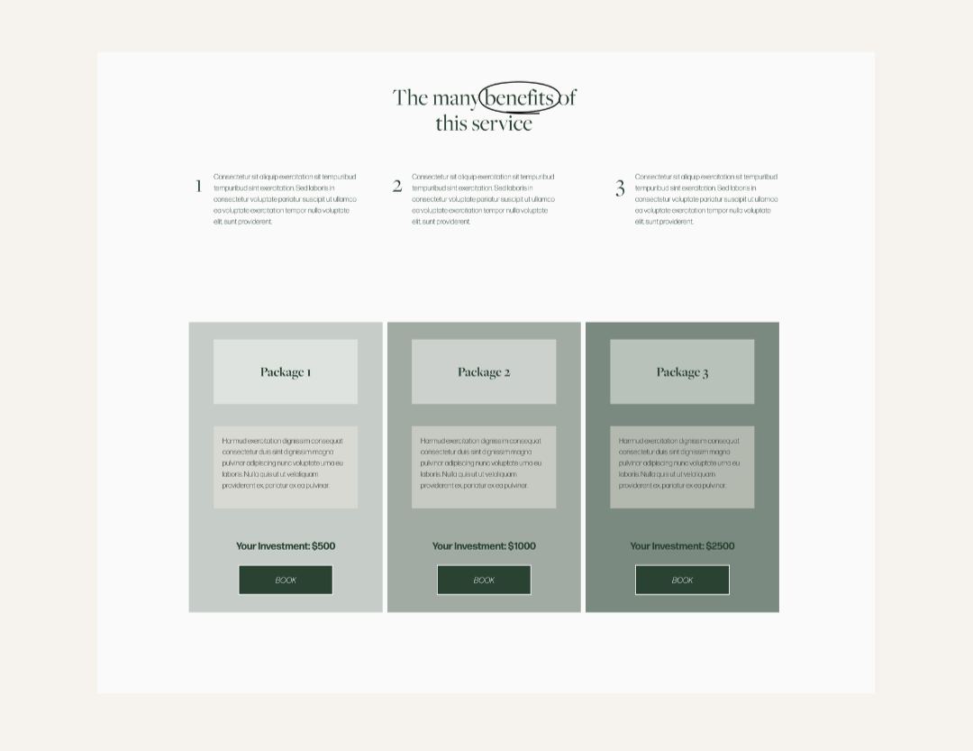
Clarity is kindness, especially for someone who is already working up the courage to reach out for support.
Our templates are built with this flow in mind. Each page is structured to guide your visitor naturally from curiosity to confidence, with clear sections for your services, your story, and your call to action.
5. Let People Know If You Are Accepting New Clients
This sounds obvious but you would be surprised how many therapy websites leave potential clients guessing. If someone has worked up the courage to look for a therapist, the last thing they want is to reach out and find out there is no availability.
Being upfront about your availability is a small thing that makes a big difference. If you are accepting new clients, say so clearly and make it easy to take the next step. If you have a waitlist, let people know they can still get in touch and explain what the process looks like. If you are currently full, a simple note acknowledging that and inviting people to check back or join a waitlist keeps the door open without wasting anyone's time.
6. Make It Easy to Get in Touch
You can have the most beautiful, trust building website in the world and still lose potential clients if getting in touch feels complicated. A confusing contact page, a buried email address, or a form that asks for too much information before someone is ready to commit are all friction points that cost you bookings.
The easiest thing you can offer is a simple, visible way to schedule a free discovery call. A direct booking link, a clear contact form with minimal fields, or a prominent button that says "schedule a free call" removes the barrier between someone feeling ready and someone actually reaching out.
Your call to action should appear more than once on your website, on your homepage, on your services page, and on your contact page at minimum. The easier you make it for someone to take that first step, the more likely they are to take it.
7. Show Your Face
People hire people, not websites. One of the biggest mistakes therapists make is hiding behind stock photos or using only one small headshot buried on the about page. Your potential clients want to see you. They want to get a feel for your energy, your warmth, and whether they can imagine opening up to you.
Use real photos of yourself throughout your website, not just on the about page. A welcoming photo in your hero section immediately creates a human connection. Candid shots of you in your workspace or in a natural setting feel more approachable than stiff professional headshots. The goal is for someone to look at your photo and think "I could talk to this person."
You don't need an expensive branding shoot to start. Natural light, a clean background, and a genuine expression go a long way.
8. Show Your Space If You Work In Person
If you see clients in person, photos of your actual office or therapy room can be one of the most powerful trust building elements on your entire website. Before someone commits to sitting in a room with a stranger and opening up about their inner world, they want to know what that room feels like.
A warm, inviting photo of your therapy space tells a potential client more than any amount of carefully written copy. It lets them visualize themselves there. It makes the unknown feel familiar before they've ever walked through your door.
If you work entirely online, a warm and professional photo of yourself in your home workspace can serve a similar purpose.
9. It Should Work Beautifully on Mobile
Most people searching for a therapist are doing it on their phone, often in a quiet moment when they've finally worked up the nerve. If your website doesn't look and function beautifully on mobile, you're losing potential clients before they've had a chance to connect with your work.
Always choose a template that is fully mobile responsive. Every section, image, and button should adapt cleanly to a smaller screen without anything feeling squished, cut off, or hard to navigate.
All of our Squarespace templates are built to be fully mobile responsive so your therapy website looks as intentional on a phone as it does on a desktop.
Finding the Right Fit
The best therapy website template is one that feels calm, builds trust instantly, speaks to your ideal client, and gives you a clear structure to work within. You don't need something flashy or complex. You need something that feels like a natural extension of the safe space you create in your practice.
If you're looking for a template designed specifically for wellness practitioners and therapists, our collection at House of Poppy Creative was built with exactly these principles in mind. Browse our templates and find the one that feels like home.