
ALIGNED AESTHETIC Regulation-Friendly Design: Creating Websites that Soothe Instead of Stress
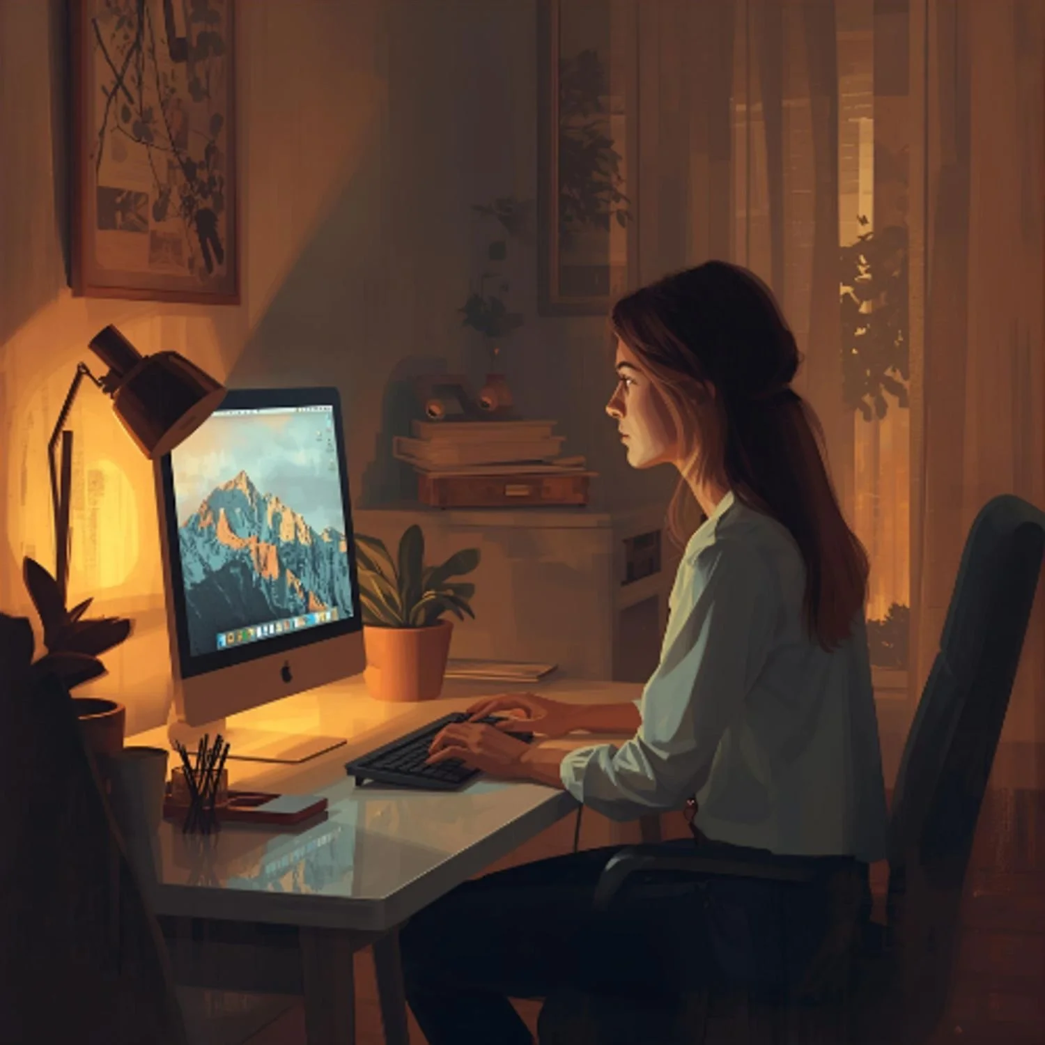
When we are scrolling a website for the first time, our first thought probably isn’t to check in with our nervous systems. Looking at screens is (unfortunately) just second nature to most of us at this point, so rarely are we being mindful of the affect it has on us at a much deeper level.
Whether its too many pop-ups, dys-regulating color palettes, or much too busy layouts, there are truly a plethora of ways to distract and overwhelm your potential customers to the point they will leave your website, without even being conscious of why.
The User-Experience as a Form of Nervous System Care
We utilize self-care outside of work, whether it is meditation, a hot bath, or curling up with your dog and a book, so why not practice it on your screens, too? For example, when users of your website know exactly what you do, and have clear customer journeys to follow, they are more likely to feel safe on your site. What are some clear customer journeys, you ask? Maybe you want them to book a discovery call with you, or perhaps you want them to subscribe to your email list so they can download a free e-book you wrote. Whatever it may be, it needs to be both obvious and easy to complete.
What Strategies Can We Use to Enhance a Website’s Overall UX?
White Space is your friend
White space is exactly what it sounds like: the amount of empty space on a page, that is not cluttered with images or text or anything else that is distracting. Think of white space as a gentle pause to process all of the previous information, especially since it is likely new information. When you were in school absorbing so many new things at once, didn’t you ever feel overwhelmed? That is exactly how your users may feel if your website is too chaotic. So, how can you tell if you might need to space things out a bit? A little trick I love to use is the Chrome plugin called GoFullPage. This allows you to take a full page screenshot of your website so you can see the whole entire thing at once. When you can zoom out and not just scroll down the page as you generally do, you suddenly can very easily get an overall feeling for your website. You’ll just instantly know by looking at the full page how it feels. It helps you see if there is a need for more balance. There may be too much content on the first half of your homepage, or a certain area that has some opportunity to move images around to create more breathing room.
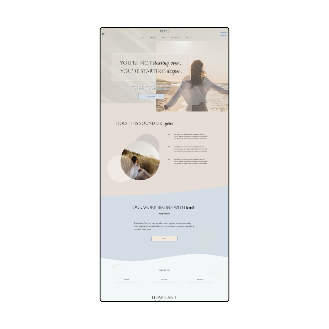
Our Petal template demonstrates the power of white space. The content has room to breathe, which in turn, eases the nervous system.
Cohesiveness & Flow
When your website is cohesive, it just makes sense to the nervous system, to your eyes, and brain. The colors are consistent, as well as the branding, and all the parts work together seamlessly. The previously mentioned plugin GoFullPage is super helpful here as well, as it allows you to get a sense of overall flow and if all your elements actually go together, or if something just feels off.
The brain actually can recognize patterns, and when it does, that is a cue to your nervous system to relax. Your website should feel like there is a beginning, middle, and end. You intro yourself and brand voice, offer some services, and end with an email sign-up opportunity. See how it almost feels like a gentle bell curve going up and coming down, so gracefully? Or a deep inhale followed by a slow and soft exhale.
Predictable Navigation
People go to a website searching for something. Whether it was a freebie they saw advertised somewhere, they want more information on your services, or maybe it’s just to re-book an appointment. Regardless of the specifics, it should be easy, as I touched on earlier. Keep your navigation links on your header as simple as possible. This is referred to as Information Architecture in UX Design. You can also use drop-downs to organize your menu. For example, you could have your specific offer pages under your Services link. Or under About, you could have your FAQ page and another page that helps users understand who you are. The goal is to not have so many separate links in one cluttered line on your header. It not only looks a lot cleaner, but it feels more regulating as well.

Our Dahlia template uses only a handful of links and utilizes a dropdown menu to keep things tidy and organized.
Regulated Copywriting
The words you use matter. Read that again. Have someone read the text on your website and ask them how it made them feel. Hopefully, it is exactly what you were going for. Calm, motivated, trusting, aligned. However, they may also feel confused, overwhelmed, or frustrated. Maybe they even feel bored by your copy. Another common thing I see with this, is words that can feel too pushy or salesy. No one tends to enjoy feeling like they are being “sold to” or convinced to buy your product or book your services.
Your copy, especially in the wellness space, should feel instantly warm and inviting. It should allow the person to make up their own mind about how it makes them feel (which is hopefully aligned with your goal!). It should allow the user to keep scrolling down the page because they don’t feel icky, they feel like they want to stay.
Take a closer look at your language on your headers. What feels better? “Let’s explore….”, and “You’re welcome to….”, OR “Book Now!”? See how using phrases such as “let’s explore how offer X could help you” use a much softer and open tone? Try those out and see how they feel for your customers.
Sensory Friendly Interactions
Don’t get too carried away with pop-ups trying to convince people to sign-up for your masterclass or download your free guide. At least delay the timing for when someone has a bit more trust for you as they have lingered on your pages for a short period of time, even a minute. You can always have these offers on your homepage with sign-up links instead, as that feels a lot less intrusive. Try to use interactions that mirror how we want clients to feel when they step into a healing space: welcomed, not startled.
Bringing it All Into Balance
A regulating website doesn’t just look “pretty.” It creates an environment where someone’s nervous system feels safe enough to explore, stay longer, and connect. It’s the digital equivalent of soft lighting, soothing music, and a welcoming smile in a physical wellness space. And most of all, it allows for authentic trust to form. If you do not have a customer’s trust, what do you really have? Think of the websites you really trust, and ask yourself why that is. Is it the soothing colors, the welcoming copy, the image on the homepage of the practitioner that feels trustworthy? The more of the above you can incorporate, the more resonate your website will feel to your audience.