
ALIGNED AESTHETIC: Designing for the Sensitive Client. What “Nervous System-Aware” Design Actually Means
If you are a wellness practitioner, then you probably understand how important your surroundings and environment are to feeling safe. And that also applies to your own website. It too, is an environment in which visitors go to gain information on a topic. When that topic pertains to health and wellness, the stakes are a bit higher. Your audience needs to feel held and seen in a way that invites them to not only stay, but get curious about who you are and what you can offer them.
So what makes a website a good environment for sensitive nervous systems?
Pacing of Information
When someone is trying to learn something new, the last thing they want, is to feel overwhelmed by the way in which it is presented to them. A good wellness website will strike a balance between information and rest periods. Is it given too quickly or is there a balance of info and rest time? Maybe you show a bulleted list of the signs you are burnt out. Instead of following that with a list of how to fix it, perhaps you place an image or motif there that gives the feeling you want to convey. Let their nervous system take in the words they just read.
And that gives way to the next point, white space versus clutter.
White Space versus Clutter
Does your website have breathing room? Just like in real life when you need to step away from a crowded space to regain your composure, a cluttered website can give that same feeling. Whitespace not only enhances the aesthetic of the pages, but also gives the nervous system a chance to integrate what it just learned. Remember, just because you are an expert on your business, does not mean someone else is, and they may need additional time to ingest and make sense of it all.

Plenty of breathing room on the Offerings page of our Willow template.
Fonts and Colors
The way words appear on the screen, as well as the colors they complement, matter so much to your audience. The wrong color palette might leave someone feeling tension in their body with no idea as to why. Ask yourself the three things you most want your intended audience to feel. Calm, content, relaxed? Or maybe excited, curious, and trusting? Scroll through Pinterest and see what images make you feel these things and see what colors are present.
Fonts can be a tricky concept to get right (check out our post on it here), so don’t be hard on yourself if it takes several tries to pick a combination that feels good to you. In short, choose something that is clean and easy to read, especially for your body text. And stay away from any heading fonts that are too fancy (script) or too “fun”. Keep things simple and clean and you won’t go wrong.

The Willow template uses soft neutrals and a deep teal to promote the feeling of calm and wellbeing.
Copy that Relates
Does your copy speak to your audience, or does it just go on an on about yourself and who you are? Make sure your audience feels seen by you, not just knowledgable about you. If someone is browsing your homepage and they have to read your life story before you can even tell them how you can help them, they will most likely get turned off pretty quickly and leave. Save the details about yourself for the About page. That’s where you can shine! And yes, your potential clients absolutely do want to learn more about you. It just is best to not lead with it.
Here is a post more about this topic, in case you are interested!
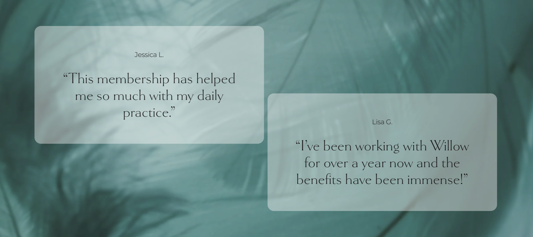
Proof of Safety
This one may seem obvious, but it is just a natural human desire to need some level of proof that you can do what you say you can do. You don’t need to list every testimonial that has ever been written about you, but just a few of the best ones that highlight your strengths the best. Don’t have any yet? Friends and family can come in handy here.
If you implement all of the above, your website will most likely make your intended audience feel welcome into your world, but also curious about how you can help them. And as always, check out our template shop to view the demos of our websites that already use the tips outlined here.